Flock

Web App
End-to-end UX/UI
UX Research
Innovation Hub is an on-campus consultancy at the University of Toronto, where researchers and designers use design thinking to tackle challenges that shape the student experience.
In partnership with the Innovation Hub, the project Flock was developed. It is a mobile web application designed to help students get involved with campus clubs. Its core features enable students to be matched with clubs actively seeking members, discover new interests, and connect with club leadership.

Timeline

12 weeks (2022)

Tools

Figma, Figjam

Role

• Led research analysis
• User interviews & usability testing
• Prototyping & visual design

Team

Yanch Ong, Min Lin, Rita Yu, Emma Chi, Susan Zhang, Myself

00 - Background

The Problem

University is a great place for younger adults to explore their passion and direction in life. New coming students at the University of Toronto(UofT) are not different. They wish to develop their school life with new interest and find a community that they belong to. Even with their strong wishes, it is difficult to get involved in clubs activities with the current setting.

The Solution

Flock is a mobile web application for student community at UofT to get involved with clubs. It provides students a unified platform to quickly view and search for all the clubs and activities in happening at UofT. 3 key features included: matching students with clubs who are also interested in them, exploring new passions, and communicating with club leaderships.

How does Flock work?

Upcoming and Following Events

After logging into Flock with UofT student ID, the Home tab will show the upcoming and following events for regular users to quickly find out the event informations they needed.

Different Clubs Exploration

There are 3 options inside the Explore tab, the Clubs allows users to search for clubs based on different categories. After finding a specific club, users can follow and find out its basic information and openings. In addition to that, they can directly contact the club’s leadership through the messaging function.

Events Nearby Exploration

The other option inside the Explore tab is Nearby. Users can search for events that are happening nearby at a specific date and time frame. Besides, they can also reserve tickets for those future events that they found out. The tickets will then show up on the upcoming events page.

Edit My Own Profile

Users can show their personality to the club leaderships as well. By clicking and editing on the Profile tab, they can add their basic information, hobbies, passions, and visions etc. to their own profile. After all, finding and joining a new community is a two-way process. It is important for students to show who they are as well.

Approach and Process

01 - Research

Background Research

In order to get a general understanding of UofT students’ attitude towards clubs and its activities, a deep dive into the online discussion forum on Reddit (r/UofT) was done. From the online community, numerous questions about clubs have been found. Most students are confused and disconnected.
The 2 main confusions are:

1. How do I find clubs that I am interested in?
2. How do I get involved in those clubs?

Survey

To further investigate UofT students’ experience and involvement with clubs activities, an online survey with 50 respondents was conducted. Same kind of confusions were again, found in the survey results.
(View the complete survey here)

User Interview

With that question in mind, 7 semi-structured interviews were conducted with UofT students. Their responses were summarized and grouped into an affinity diagram with similar themes.
3 main pain points were found:
1. Scattered Information Channel
Existing information is scattered across social medias and official school website. It is hard to find the clubs that students are interested in and what those clubs do.
2. Lack of Access
The Club Fair which is held once a year at the beginning of fall semester seems to be the most useful resource.  Once students missed it, they don’t know where else to look information for.
3. No Communication Bridge
Club organizers/leaderships often felt busy or unsure about responding to a student who they know nothing about. As a result, most students who tried to reach out don’t hear back and don’t know how to get involved.

02 - Empathize

User Persona

After analyzing the qualitative and quantitative research data, the user persona:
Mia the One Person Show, was created to further emphasize with the user group.
User research revealed that Mia needs a way to:

• find useful clubs information that she is interested in.

• contact and communicate with the clubs leadership.

• participate in clubs activities.

As-Is User Journey

Even social butterfly like Mia is having a hard time to find a community and get involved in clubs at UofT. To better understand her pain points, a journey map of how Mia currently tries to join a drama club was created.
Because of the scattered source of information and lack of communication channel, Mia found it extremely difficult to get involved with a club after missing the club fair. She felt left out and disconnected eventually gave up on drama clubs because of the confusion.

03 - Define

Design Goal

3 main design goals are identified after analyzing Mia’s journey to join a club:
1. A student who wants to develop a fruitful life outside of academics can discover new hobbies that they never even considered in the past.
2. A student interested in clubs can find useful information about clubs without going to the Club Fair, at any time, from anywhere.
3. A student who wants to join a club find a club which they are interested in joining that is also interested in them.

04 - Ideate

Big Ideas

With three primary goals in mind, extensive brainstorming and ideation sessions were conducted. Ideas were evaluated and dot-voted by the team based on impact and feasibility. Three standout concepts emerged, which were selected for further development into a potential app solution.
Digital Club Fair
Run around with your characters like in an MMORPG. Similar clubs are grouped together.
✅ Like:
The conceptual metaphorSense of exploration
• Sense of exploration
❌ Dislike:
Not feasible
Club Dating
Hinge for Clubs. Swipe through club profiles. Navigate through many options quickly.
✅ Like:
Engaging, digestible profile
• A two-way process
❌ Dislike:
Relies on blackbox algorithm
What's up?
Check a time and place and see what activities are going on. Fill a gap in your schedule.
✅ Like:
Event-based approach to club involvement
❌ Dislike:
Inconsistent

The Idea

Combining the best parts of every idea

Elements from each of the top concepts were synthesized into a unified idea—Flock, a gateway to club involvement. Its key features include:
• Explore dating-inspired profiles of clubs like at a digital Club Fair
• Get matches for clubs and communities we know you’d like
• See interesting club activities that fit your packed schedule
• Connect with clubs, let them know who you are as a person

To-Be User Journey

The 3 big ideas were integrated into Mia’s journey of trying to join a drama club. In Mia’s new journey, she is able to communicate and found a drama clubs that she belongs quickly and smoothly.  In addition, she even found a new passion after joining a nearby event. This time, Mia is fulfilled and connected.

05 - Prototype & 06 - Evaluation

Low-Fidelity Sketches

Based on the 3 big ideas and 3 design goals,
we created a low-fidelity prototyping covering 3 tasks:

1. Finding and following a club I am interested in.
2. Finding information about an activity happening nearby.
3. Edit your own profile to include your passions.

Lean Evaluation

To identify early-stage usability issues, a lean evaluation was conducted with 6 representative users. The methods included a 5-second test, think-aloud testing, and a post-test semi-structured interview. Below are some of the key findings:
1. Restructured Information Architecture
*Before
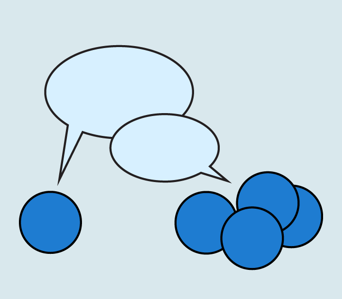
Clubs was originally the Home tab, but searching for clubs was an infrequent task. The most common tasks were likely: 1) Viewing upcoming activities I signed up for 2) Viewing activities from clubs I follow. However, these were hard to discover in the Profile and Activity tab respectively.
*After
The information architecture was restructured to improve usability. The two primary tasks were moved directly to the home page for easier access. Remaining features were consolidated under an Explore tab, designed to support discovery of new club opportunities.
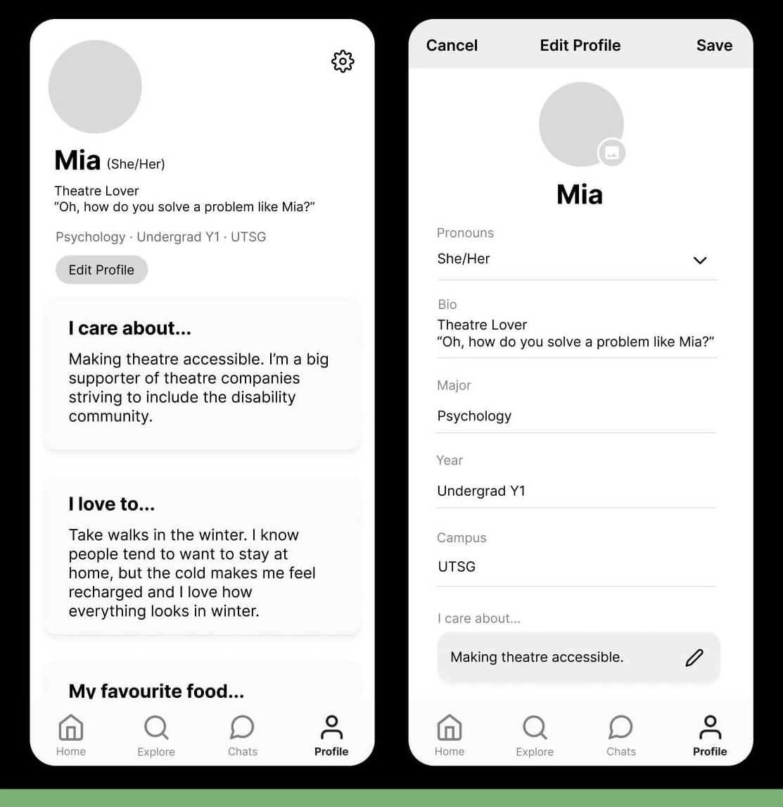
2. Reimagined Personal Profile Page
*Before
An unexpected insight emerged during testing—participants reported feeling uncomfortable due to the layout’s resemblance to a dating app. The presence of multiple personal photos on an official university platform caused embarrassment and discomfort. In this case, the familiarity of dating app interfaces had an unintended negative impact on the user experience.
*After
The customizability of the prompts was retained, but the design was adjusted to feature just one photo. The final interface drew inspiration from LinkedIn, incorporating a more official and formal aesthetic. Additional professional information, such as faculty and year, was included to enhance the platform’s sense of credibility and purpose.

Medium Fidelity Storyboard

Based on the evaluation findings, a mid-fidelity prototype was developed. An initial component library was established, and all screens were refined to ensure consistency in visual style. A storyboard was created to effectively present the user flows, as shown below.

Usability Testing

A second round of usability testing was conducted with the mid-fidelity prototype and 6 representative users. Below are the key findings:
1. Detailed Information for Activity Tabs
*Before
Participants liked the nearby exploring feature. However, they found the search location marker confusing and wanted more information on the map. Most participants did not realise they could swipe the bottom menu up.
*After
The search marker was removed, and category markers were added to the activities for better organization. Additionally, a handle was incorporated into the bottom menu for improved navigation.
2. More Friendly Directions to Users
*Before
Participants were overwhelmed by the empty home screen and did not know what to do.
*After
A call to action was added to direct users to the Explore tab to discover clubs and activities. Additionally, a more comprehensive onboarding process would be introduced for new users, guiding them to select an initial set of clubs that align with their interests.

Style Guide

Flock is an app designed for the University of Toronto specifically. In order to show a sense of unity, the style guide was developed by strictly following UofT ’s brand guidelines.
1. The Typeface
Trade Gothic in regular and bold styles were used in Flock. The minimum font size in body copy for print is no smaller than 9.25 point.
2. The Colors
Primary color is UofT’s signature blue. 3 other secondary colors were picked from the guidelines to represent a sense of diversity and colorful life in the UofT campus. 3 other neutral colors were used as background and text colors in Flock.
3. The Logo
The Flock logo is inspired by the Defy Gravity workmark and its caret symbol. To inherit the value of upward momentum and rising above any challenge, 3 caret symbols with different colors were used in the Flock logo. The 3 colorful caret symbols represent an upward momentum to move together, with diverse groups and communities.

07 - Conclusion

Next Steps

With the 3 goals, countless amount of brainstorming and ideations were done. The ideas were dot-voted among the team based on impact and feasibility. There are 3 popular ideas that we decided to take it to the next level and further develop the concept as an app.
1. Expand club-applicant messaging
The situation of club leadership not replying or replying in a slow manner needs to be further researched and analyzed.
2. Companion Interface
A companion prototype has to be created for club leaders to communicate with members and put up events. This will be based on the club leadership research.
3. Flock & UofT Services
There is an opportunity to explore how Flock integrates with other UofT services, such as the Student Life App and the Student Organisation Portal.

Lesson Learned

1. Listen and Observe Carefully
Sometimes, what participants say and do during user interviews or usability tests may seem like a minor issue, but it can reveal an important underlying problem. For instance, one participant mentioned feeling confused about the personal prompt on the profile tab. This feedback highlighted the need for a more thorough onboarding experience, including an introduction and a walkthrough for entering personal profile information. It's essential to analyze every clue and piece them together to form a clearer, more comprehensive understanding of user needs.
2. Fostering Collaboration within a Team
This was the first time working with team members who didn’t have a prior design background. Initially, the process was frustrating, as not everyone fully understood the concept of design thinking. However, I realized that adopting a more open-minded and welcoming attitude in communication encouraged team members to share their insights more freely. Every individual has a unique and valuable perspective. It is crucial to value each team member and ensure that everyone's voice is heard.